As most of you know, my blog is on hiatus. I send out a monthly newsletter with new images every month. You can sign up for the newsletter on any page.
Here are a few of my new paintings.
As most of you know, my blog is on hiatus. I send out a monthly newsletter with new images every month. You can sign up for the newsletter on any page.
Here are a few of my new paintings.
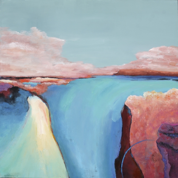
Although I have painted many scenes that include lakes and rivers, I have painted very few seascapes or paintings that included the sea. When I was in Ireland, I spent many hours looking at various views of the Atlantic Ocean. In the back of my mind I was frequently thinking about painting a seascape.
Most were from high cliffs looking down at crashing waves hurling themselves into caves and onto rocks. There were a few times when I was on a lovely beach or standing on a small hill looking at a quiet tide.
Regardless of the location, I was fascinated by the continually-varying mood of the water and its great force. I was also intrigued by the ever-changing colors of the sea.
Although I experienced little rain while I was there, I was impressed by the moody skies and how the grey clouds affected the water. Sometimes there was no difference between the colors in the skies and on the water. Sometimes both contained light and dark greys, violets, blues and greens.

Futile the Winds, acrylic on canvas, 14 x 14 x 1.5 inches. Ann hart Marquis
Since I love to play with color, it was my goal in this painting to capture all of the different grays of the sky and water and the vibrancy of the surrounding landscape. The entire painting has many layers of color from bright and light to dark and somber in both the seascape and landscape.
I would love your critique.
Do creativity and travel change how I paint? As I have been working on the second painting of my Ireland series, I keep thinking about how traveling to places away from home influences my work.
That certainly was the case for me for years in France. Whenever I was there, I not only was affected by the scenery, I was also influenced by the age of the country, the people, the food, the quiet country roads and the lovely village in which I worked.
Spending a month in California at an artist residency last year allowed me to experience living in an old farmhouse in the middle of a vineyard and seeing how old, gnarled vines tangled around each other.
I have also painted a short time in Italy and Chicago. So I ask myself, have all of these experiences actually changed the way I paint and the way I see the world?
It is something for me to ponder since I first started painting in the southwest of France. After I came home, I painted what was in my environment or from photos in a painting class. At that time I was just trying to learn to paint.
Not long ago I read that “In recent years, psychologists and neuroscientists have begun examining more closely what many people have already learned anecdotally: that spending time abroad may have the potential to affect mental change.”

First Rose of Spring, acrylic on canvas, 24 x 30 x 1.5 inches
Which brings me back to Ireland. I love France, but it doesn’t seem to have the spiritual punch for me that Ireland does. I am not really sure yet what that means.
I didn’t paint in Ireland, so I am relying on my memories and impressions for subject matter. I haven’t painted from photos. It is a very rural country. It is perfect for painting abstract landscapes. But creating a lovely landscape painting is not how or why I paint.
I paint in order to express the feelings inside me of something that inspires me. This series has a different feeling for me, but I can’t tell you why yet.
Here is a quote that I came across today by Miriam Beard about creativity and travel.
“Certainly, travel is more than the seeing of sights; it is a change that goes on, deep and permanent, in the ideas of living“
I have been going through all of the images that my partner Tim Anderson took while we were in Ireland. It helps that he is a professional photographer. He did all of the work, I just soaked up what I was seeing a experiencing. With every photo I am taken back to that spot and the way I felt while being there.

Photo by Tim Anderson of the Atlantic
Although there were indeed 40 shades of green, we spent much of our time on the west coast near the Atlantic so there were also many shades of blue. I have seen the Pacific Ocean and the Atlantic, but the waters on the Irish Atlantic were very vivid and distinct.

Ann Hart Marquis-Painting sketch, acrylic on paper.
There were also shades of red and orange and tones of violet. Those colors were lovely also, but they didn’t impact me like the blues and greens.
I saw many places like stone circles and standing stones and 12th century abbeys, where grey stone was the predominate color. I haven’t processed grey as possibilities for a painting, but I like the idea of using greys and tones of color.
This week I have finally had a chance to do a little sketching with paint to just get a feel for what colors would come out. I played with many colors, just letting my imagination take over without doing any pre-planning. I felt like I was painting my impressions of Ireland. I like that feeling. I like to pick up a paint brush and just start putting down color.

Ann Hart Marquis-Impression of Ireland, acrylic on paper.
I still went for layering paint the way that I have been doing. I do like to see under colors peeking through. The paint sketches in this post are a start to bigger paintings that I hope to get to soon.
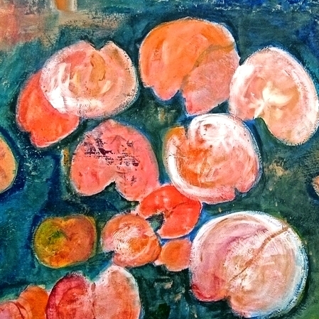
California state’s flower is the golden poppy. Native Americans cherished the poppy as both a source of food and for oil extracted from the plant. Its botanical name, Eschsholtzia californica, was given by Adelbert Von Chamisso, a naturalist who arrived in San Francisco in 1816 surrounded by hills of the golden flowers. Also sometimes known as the flame flower, la amapola, and copa de oro (cup of gold), the poppy grows wild throughout California. It became the state flower in 1903.
I grew up in the country there. On the rise behind our house was a rolling hill much like all of the other soft rolling hills in northern California. One of my earliest memories was of a spring day when I was about 4 years old. I had wandered away from the house drawn by all the beautiful gold that I could see in the hill. I knew the gold was flowers, but I was mesmerized by the color.
I remember sitting in the middle of this thickly-covered field of golden poppies. I was delighted and it was perhaps one of my first joyous experiences. I remember how delicate they were and how some were fully open and some were wrapped tightly. I remember their fragrance. They fascinated me. I have been in love with poppies since that time.

Remembrance of Poppies, acrylic and ink of canvas, 30×30 inches.
I have been thinking about painting poppies for a long time. Last week I decided to paint that hill and that experience. I started like I have been doing lately with many layers of background color. Before I started adding a field of golden poppies as I had planned, I realized that there were so many poppies in my memories that I would soon have an abstract orange painting.
That is not what I had in my mind. It wasn’t capturing the feeling that I wanted so I decided to limit my poppies to make them and the painting more symbolic to me. The above painting is what evolved. The photograph below is how I remember the hill:

California poppies
I consider myself an abstract landscape painter. As I lean more toward the abstract, I find myself struggling to completely give up the horizon line. As I looked at many abstract landscapes, I would say that about 95% have included one.
So I am wondering in landscape paintings, do people have a psychological need to see the horizon line? I spent about two hours trying to find some hint of information about why we like to see that line, but I could find nothing.
In defining this line, a common definition is that it is an imaginary horizontal line, sometimes referred to as eye level, which divides your line of vision when you look straight ahead.
Here is one of my paintings with an obvious horizon line.
Opposition, acrylic on canvas, 24x24x1.5 inches.
Objects below this line are below your eye level, and objects above this line are above your eye level. Artists supposedly draw horizon lines to accurately establish perspective in their work.
According to the Creative Glossary, “It is not necessary to include the horizon line in a landscape. However, it is important to include a ‘virtual’ horizon line in order to make a picture follow correct perspective. The horizon line is always one’s eye level. If one draws a line perpendicular to the ground outwardly from one’s eye level, this is what is considered the horizon line.”
Then there is this thought: “Be careful not to confuse skyline with horizon line. Skyline is also where the sky and land meet, but is generally in reference to mountains which are almost always above the actual horizon line/eye level.”

Skyline as Opposed to Horizon Line
Here is an abstract landscape painting by Joan Fullerton. Can you see the perceived horizon line or where eye level is?
Aspen Textures, Joan Fullerton
How about this one by Stuart Shils. Where is eye level?
Stuart Shils Landscape
Where am I going with this? I don’t know. I am getting rather left-brained about this topic, but it is something that I need to continue thinking about. When you create a painting or look at a painting are you aware the horizon line or where eye level is? I would love to know what you think?
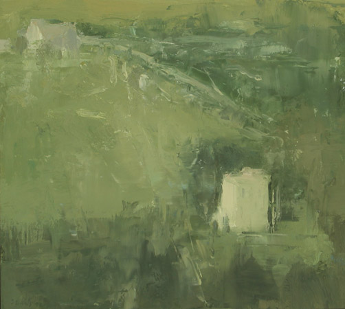
For the last two weeks I have been writing about metaphor and how a creative work can have different meanings to different people.
Coincidentally, several days ago I posted an announcement for my upcoming exhibit at the New Mexico Cancer Center on Facebook. The announcement also contained this painting.

The Ravine, 18 x 24 x 1.5 inches, acrylic and charcoal on birch cradle.
I gave it no title on my Facebook post and said nothing about it. Within two minutes my friend Robin Sanders, an ex-Marine who lives in Texas, made this comment about the painting. He obviously didn’t give it much thought, he just pulled an association from his life.
“The struggle is real for these surviving five lone trees. Set among the desolate but green hills, they are what’s remaining… SURVIVORS.”
This is not what I was thinking as I painted the scene, but because of this young man’s experiences, he came up with a different metaphor than I would. He probably would title this painting “The Survivors.”
This painting is part of a series that I did at my artist residency in Healdsburg, CA in June. I could have called it Hill Oaks, or Looking East, but I chose to look at the painting from a different perspective. My metaphor? Perhaps looking into the future, being in awe at all of the open space or wondering what was beyond my sight.
Which brings me to painting titles. With some paintings, the title reflects the metaphor that I am trying to project. Some paintings just get a descriptive title. In any case, I think that titles or art work deserve a little thought or introspection. I don’t title a painting until after it is finished because I don’t know where it is going or how I will know when it is finished.
In Lisa Pressman’s art blog she says that painting titles “are crucial—not only for the viewer but also for myself. They are a suggestion, a signifier, an open door, a thread, the light: to a way to approach the image.” I couldn’t have said it better.
Do painting titles influence you?
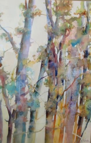
Almost two years ago I took an online Abstract Landscape class taught by Pauline Agnew. We used acrylic paint, and soft oil pastels and baby wipes.
During this class I painted exclusively on watercolor paper. I choose not to use canvas because when used with acrylic paint, they cannot be preserved with acrylic varnish. They need to be framed. We spent some time on Monet-like water lily paintings. I didn’t like mine particularly at the time.
Since I have now finished all of my paintings for an upcoming exhibit, I had some time to play with the oil pastels again. I did another water lily scene which I like much better than the former paintings.
Water Lily Pads, acrylic and oil pastel on paper, 12 x 12 inches.
Oil pastels are a very different from soft pastels. They are greasier and from what I have read, do not work well for a realistic painting. They are good for expressive and impressionistic work because they glide so effortlessly and are very vibrant and creamy.
They can build up some subtle or dramatic texture as well, which you may not see with soft pastel. I have read that they lend themselves wonderfully to all sorts of techniques from scraping and stippling to color gradations and overlays.
As for mistakes, once you put them on paper or canvas, they are difficult to remove. I used baby wipes to spread around the color or to try to reduce it, but they cannot be removed completely.
I used Mungyo Artists’ Soft Oil Pastels because they were inexpensive and I didn’t know if I would like them. That was a good move on my part, because I don’t particularly like to work on paper and I don’t want to frame my paintings. They were an interesting experiment and I have friends who love them.
If you read my post two weeks ago, you saw how I “fixed” a painting with which I was not satisfied. In all of the years that I have been painting there is at least one painting that I just can’t get right no matter how hard I try and how many coats of paints and glazes I have used to try to get the painting just like I want it—something that I think is a good painting.
I have one of those paintings now. In my post about it, I said, “So now with this painting finished and the others resolved, I seem to be almost ready for the exhibit. I think it is finished, but I have to live with it a while.”
Well, I lived with it for about three days. One of my first thoughts was the name of this painting is Evening and the sky did not reflect an evening sky. It was not an evening painting. Next the forefront of the painting seemed to light.
And then what about that building. It was a dull color. The real building which was my studio was red. It needed to be red.
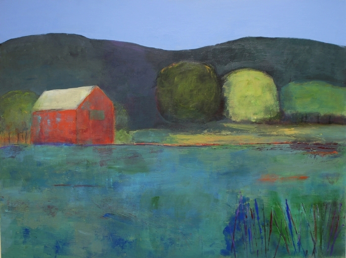
Evening at Chalk Hill, acrylic on birch panel, 18 x 24 x 1.5 inches.
I then painted the sky a violet blue, the studio red (a mixture of cad red light and alizarin crimson) and the foreground darker colors. I also added more reeds in the front, left and made them darker. I didn’t touch the mountains or trees. I did take out the orange-red that was below the trees.
It is now looking good. I think.
Better than two weeks ago. What do you think?

Evening at Chalk Hill, acrylic and ink on birch wood panel, 18 x 24 1.5 inches.
As some of you know, after living with a painting for a while, I may think it needs a little touch up or perhaps I see what I would call an error that just doesn’t work. I can always remove an element from a painting, paint over a section or change the look. That is the beauty of painting with acrylic.
This week I took a painting on birch panel that had been bothering me for some time. I felt that it was not very imaginative. I didn’t need to spend much time with it before I decided it had to go and I wanted to keep the expensive panel.
As I mentioned in my last post, sometimes when I look at a painting that I did months ago, I know my style has changed and I find the old work lacking in some way.
First let me show you my new painting. I am very pleased with the way it turned out. And I don’t think that I will be touching it in the future.

Ridge Oaks, acrylic on birch panel, 20 x 20 x 1.5 inches.
I took the old painting, turned it sideways because I liked some of the colors on the side of the painting, drew a horizon line, painted the sky and just started painting over the bottom half.
I layered the bottom half with mixtures of blue, turquoise and green and dabbed on some contrasting color here and there. It was all rather done by intuition.
It was fun and rather exciting to do because I had an exact image in my mind of what I wanted the finished painting to look like. And it was easy, although in some spots I had to do several new layers to cover a dark color.

Chalk Hill Oak, acrylic on birch panel, 20 x 20 inches, 2015. ©Ann Hart marquis
Here is the original painting which I thought was rather mundane. I am happy that it is still part of my new painting. Nothing ventured, nothing gained.
