Category Archives: Painting

Artist Critique Group

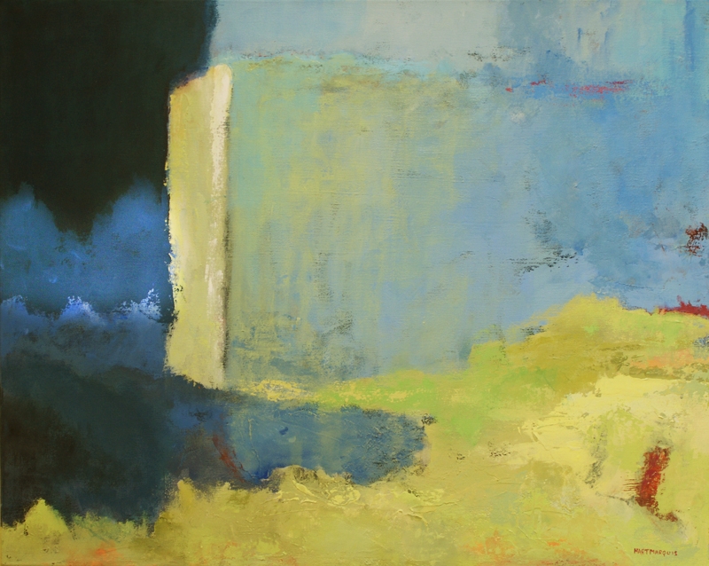
If you read my blog with any kind of regularity, you know that I sometimes think a painting is finished, live with it awhile and then decide that it has some kind of major problem. I have just come to the point on the painting below that it is time to just stop and take a long look at it before proceeding.

Ann Hart Marquis painting for artist critique group

Untitled- Ireland, acrylic on canvas, 24x30x1.5 inches. ©Ann Hart Marquis

Fortunately, next week I start an abstract painting class where I can work on what I want including getting feedback from the teacher Janet Bothne. If I feel stuck or think that I don’t know what to do next, I can get advice. So this class sounds perfect for me.

In addition, this class includes a critique time with the whole class where I can get or give feedback. I have been looking for an artist critique group for several years. I am excited about the idea that other people will be giving me opinions about my work.

I have friends who do not like to have their work critiqued. According to artist and blogger Sharon Hicks,Some artists cringe at the mere thought of having their work critiqued. The very word ‘critique’ is based on the word ‘criticism’, and in our culture that word has taken on a negative connotation, since to criticize something usually means to point out its faults.”

According to the dictionary, however, the word critic derives from the idea of someone who judges, evaluates, or analyzes literary or artistic works, dramatic or musical performances. To me this is a neutral statement. Ideally a critic can give both positive and negative responses. It relates to the idea of useful criticism.

For me, good and useful criticism  serves one purpose: to give the creator of the work more perspective and help them make their next set of choices. I like the idea of having a set of choices.

I am also open to critique right now. If anyone has ideas of where this painting needs to go next, I would be delighted to hear them.

My Artist Muse

Yesterday I finished a painting that I had been working on for some time. So today the question was what should I paint next? I have been primarily working on medium-large canvases, 24×30-inches. It takes me about a week to finish this size painting if I get to the studio almost every day.

Today I felt some pressure to think of what I wanted to paint next. It does not work very well if I am feeling pressure when I paint. And I had no inspiration for the next painting.

So instead of starting on another large canvas that would take some planning, or at least giving some thought to an image, I followed by friend Dotty’s example to do a small format painting in a day. It actually took me less than an hour and I am happy with the results.

Ann Hart Marquis-How artist muse helped create My Mind's Desire

My Mind’s Desire, acrylic on canvas panel, 8×6-inches.

There was certainly no pressure involved. My process included finding a sample of coarse molding paste, letting it dry, having some lunch, then going back to my canvas. I then applied random paints that were in the same palette as my last painting and very loosely applying them.

So this brings me to thinking again about inspiration, motivation and the muse. By the way, I don’t think I have an artistic muse. Unless I think of the word as a verb: chew over, contemplate, excogitate, meditate, mull, mull over, ponder, reflect, ruminate, speculate, think over.

 I do sometimes need to wait for inspiration. I have been thinking a lot about how I get inspired to paint a certain scene. I think that it comes down to thinking about a place I have been or perhaps looking at a photo of a place that brings forth some kind of feeling in me.

It also may involve including some sort of paint or medium that I have not used for a long time or maybe never—like coarse molding paste.

So I have been contemplating, mulling over and reflecting what I will do next. It may be a larger version of the one above. I am still pondering, but with no pressure.

Do you ever feel pressure to be creative? Do you have a muse?

Painting Series

Painting  series is something I started doing about 5 years ago. It took me a long time to realize the significance of doing a series instead of random subjects that appealed to me.

Before that, in my mind I was painting series because I was painting landscapes. All different kinds of landscapes with different colors, sizes and sometimes style.

I have learned that if you make art for yourself and no one else, then you can paint whatever you want. If you make art to sell or gain the attention of collectors or galleries and you’re interested in having people appreciate and understand what you are trying to convey, it is better to let others see where your attention lies.

According to Alan Bamberger at Art Business.com, “the easiest way to do that is to work in series– to create unified, cohesive, coherent, related bodies of work. Many artists aren’t fully aware of the advantages to creating multiple works of art around the same idea, theme, philosophy, concept, topic or subject matter. Instead they produce what I call “onesies.”

painting study of western Ireland

Ireland study, acrylic on canvas, 8×10 inches.

I have learned that painting  series is a way of exploring several different variations of an idea or theme. There are many benefits to creating a group of similar-styled artworks. Related paintings look a lot better on a website or in an exhibit rather than a mixture of different looking artworks. I did my first painting of Ireland last week and it was posted on my last post. Above is another study I just did for my second painting in the series.

However, it can also be challenging to work in a series. I started a series several months ago, sold one, painted a second and then went to Ireland which completely consumed all of my attention. I want to work on a series of Ireland. So now I have one painting that I did for a previous series that goes with nothing. I think that is the nature of creativity. Our attentions can change.

But I have made a commitment to myself to finish my Ireland series. I have never felt as strongly about a series. It will be interesting to me to see how many I will do.

Black Gesso Drama

At the beginning of last week, I had been back from Ireland for about two weeks. I was anxious to get started on a series of my experiences, but I couldn’t quite get to any concepts that called to me.

Also, right after I got back, my classes at the University of New Mexico started, including one new class involving texture and different mediums.

Black Gesso

One of the products that I wanted students to try was black gesso. I hadn’t used it for quite a while, but I thought the students would find it interesting. After demonstrating the use of black gesso, I realized that it was just what I could use to represent the enigmatic energy and mystery that I felt in Ireland as illustrated in the photograph, below.

photo showing how black gesso could enhance this photo

Down Patrick Head, County Mayo, Ireland. Photo by Tim Anderson

Here is a little description of black gesso: Historically, it is for oil painting. It was traditionally used to prepare or prime a surface so oil paint would adhere to it. It is made from a combination of paint pigment, chalk, and glue binder. Gesso would protect the canvas fibers, provide a nice surface to work with and give a little flexibility so the canvas wouldn’t crack if it was rolled.

Acrylic gesso doesn’t contain glue. Acrylic paints are non-corrosive and stable over time, so you don’t need to worry about the paint damaging the canvas, and therefore, you don’t need the glue in the mix. So in making black gesso for acrylics, out went the glue.

painting showing how black gesso adds mystery to an image.

The Mystery of Time, acrylic on canvas, 24x30x1.5 inches.

I use gesso on all of my canvases before I paint. It makes the canvas ready to accept acrylic paint. Without gesso, paint can soak into the weave of the canvas.

So this past Monday I began a canvas prepared with black gesso. I wanted to use it to let it show through in random places. I liked the effect. So off I went getting a feel for how to represent the beauty and power of the Atlantic Ocean, the breathtaking cliffs and all of those shades of green that I saw. The above painting is the result-the first in a series.

I would love your critique.

Irish Color

We just got back from Ireland. I am full of images of Irish color, cliffs, water, trees and too many other sights to name. I just soaked it all in. Although I didn’t take my paints, one of the things on which I concentrated was color. It was indeed so green. They were vivid, intense greens.

photo describing Irish Green

Irish Green

I have a tendency to paint with a more muted palette, so I am not sure yet how I will translate these images onto the canvas. I plan to start trying this week.

picture of Irish Green

Irish Green

If I was still at a place where I wanted to paint landscape, Ireland was the place to see. But I am an abstract landscape painter, so it is all a mystery to me at this time because I haven’t started to think about mixing paint. There is still a part of me that is processing all that I experienced there.

photo showing Irish Yellow Green

Irish Yellow Green

Ireland was magical and spiritual for me. Part of the reason that I found it so compelling was the beauty, but since we visited many megalithic sites, I was captivated by the mysteries of how and where people lived and expressed their creativity 5-6 thousand years ago.

photo showing Irish Red color.

Irish Red

Ireland is also being overwhelmed with invasive rhododendrons. Since they are so lovely, people don’t seem to mind these invaders.

photo of Irish Rhododendrons

Irish Rhododendrons

So you may be able to tell that I have no idea what I will paint when I am completely back from Ireland.

My Love Affair with Painting a Pear

showing how painting a pear is done

Pear on the Horizon, acrylic on wood panel, 11×14 inches.

I have a little love affair with painting a pear. It shows up in various places, like teaching for example.

I teach a painting class at the University of New Mexico Continuing Education Department for complete beginners. I teach it every quarter. Because almost all of the students are actually beginners, I start by having them mix colors and I talk about the definition of value. I also have them paint something round to begin their process about shape and perspective.

showing how painting a pear is done

Walnut and Pears, acrylic on canvas, 16×20 inches.

I frequently choose a pear for them to paint because they are much more interesting than a banana or a melon or a baseball, for example. I like pears because they come in quirky shapes and have lovely “hips” to add interest to a painting, and I always pick a pear with a special stem.

painting a pear in France

French Pears, acrylic on canvas, 16×20 inches.

This week as always in the class, I start the pear assignment by doing a demonstration of how I paint a pear. It is usually a successful assignment for all students and I think it is a good focus for the first class.

The task includes choosing the complementary color of the pear that I brought. This week the pear was yellow/green and the background was red/violet. It is an easy assignment.

We didn’t have time to finish the background so that was the homework, including home work for me. I am in the middle of another painting, but finishing my pear painting turned into a very relaxed meditation. I have painted many pears, but I especially liked the shape of my drawing. Here is my version of the class assignment:

example of painting a pear for a class

Pear, 9×12 inches, acrylic on canvas board.

Everything felt just right and there was no stress about inspiration like there can be with a series that I am working on. I was just pleasurable. I find that painting things that I have painted before, that I may never sell, is just pure delight.

Richard Diebenkorn and Micaceous Iron Oxide

When I came across rules written by Richard Diebenkorn, one of my favorite artists, I identified with them immediately. I also found it quite moving that these were rules for himself and were only discovered in his studio after his death.

Diebenkorn rules—Note to myself on beginning a painting:

  1. Attempt what is not certain. Certainty may or may not come later. It may then be a valuable delusion.
  2. The pretty, initial position which falls short of completeness is not to be valued—except as a stimulus for further moves.
  3. Do search. But in order to find other than what is searched for.
  4. Use and respond to the initial fresh qualities but consider them absolutely expendable.
  5. Don’t “discover” a subject—of any kind.
  6. Somehow don’t be bored—but if you must, use it in action. Use its destructive potential.
  7. Mistakes can’t be erased but they move you from your present position.
  8. Keep thinking about Pollyanna.
  9. Tolerate chaos.
  10. Be careful, but only in a perverse way.

I especially like rules number 1 and 10.

Micaceous Iron Oxide 

Micaceous Iron Oxide

I first attempted what was not certain by covering a piece of hard board with micaceous iron oxide which I had not used before. It is a very dark medium and it is very gritty, like sandpaper.

I am rarely very careful, so that was not a problem. I just layered on the medium to see what would happen.

I decided to paint a tree because I don’t have to discover how to paint a tree. I have painted many (rule #5).

The acrylic paint went on the micaceous iron oxide in mysterious ways, needing more than one layer of one color and fewer of another. As you can see (Shadows), the under layer was quite absorbent. I like the darkness of the finished painting and I will do another soon.

I love the results and I loved trying to be Pollyanna, which I rarely am.

Here is the final result.

painting showing effects of micaceous iron oxide

Shadows, acrylic on micaceous iron oxide on hardboard, 7×8 inches, matted to 14×18 inches, framed

Do you identify with any of Diebenkorn’s rules?

Isolation Coat for Acrylic Paintings

What is an isolation coat? Traditionally, an isolation coat on a painting is a coat of some kind of gloss medium when you finish a painting. It is transparent and goes between the finished painting and the varnish. It is always a good idea to varnish a finished painting to protect it and add to its longevity.

If being archival is important to you, you can add an isolation coat. If you think that it may not be around for 100 years, you can just varnish it when it has dried completely. This is key because otherwise the varnish will stick to your painting and be a nightmare to try and remove. Varnish is not permanent, it just acts as a dust collector that you can remove and replace, every 10-20 years depending on how dusty the environment your painting is kept in.

Using an Isolation Coat Between Layers

An isolation coat can also be used between layers of paint on a surface. I used several layers of a gloss medium between layers in order to form a barrier so that the next coat of paint can allow you to let whatever you have first put on the canvas remain visible, if that is your plan.

Ann Hart Marquis- an painting describing how to use an isolation coat

A Dream for My Father, acrylic and ink on canvas, 30x30x1 inches.

The basic process is do the underpainting. I like to first add color all over my canvas, do some mark making and random colors, let dry, then lay down a thin layer of acrylic gloss medium. That’s the basic process. In that way, if I am basically creating a blue painting, but I want another color showing through, I can paint over it and leave parts of it showing. Perhaps I originally made a very dark mark and I want it to be almost invisible, I can cover it with the second coat of paint.

In this painting I did about three isolation coats somewhere on the canvas and painted over them. I like the process and the effects it gives me. I think that you can see some of the under-details for yourself.

After it dries for about 2 weeks, I will varnish it.

Golden High Flow Acrylics

This week and last week I was experimenting with Golden High Flow acrylics. High Flow is their newest acrylic paint that can go from “brush to marker or from dip pen to airbrush and more. From fine lines to broad strokes, High Flow Acrylic has an ink-like consistency that lends itself to a wide range of techniques, including staining, leveling, calligraphy, and mixed media.”

Like the painting in my previous post I started this new painting with various background colors and a little light blue house paint. I then painted some random trunks.

Next I got out the indigo blue and turquoise high flow bottles and my water spritzer. I poured a drip of high flow to the top of where I wanted the tree branches to start and immediately shot the drip with water. Like last week the paint bloomed into interesting tree like patterns.

Ann Hart Marquis-using high flow acrylics and water

Waiting for the Morning Sun, acrylic on canvas, 14 x 14 x 1.5 inches.

It was fun to use and I loved the surprises I got from adding the spritz of water. High flow paint works well as a pour. According to Golden, it is well suited for use on large areas, where the thin consistency allows for free flowing color layers.

The pigment size and intensity varies between each of the 49 colors. Unlike other acrylic paints high flow paint is not degraded by water. It retains its intense color due to their high pigment load.

They can be modified as needed with water when working on paper and other absorbent surfaces.  Over thinning with water can create sensitive paint layers, especially when used on non-absorbent surfaces.

I enjoyed the spritzing process and now I want to see what I can do with washes and letting it free-float all over a canvas. Are you experimenting with anything new lately?

Using House Paint in Art

I never thought my art had anything in common with Pablo Picasso or Jackson Pollock’s work. Well it appears that we do have one thing in common. We all used everyday house paint on our canvases.

“Pablo Picasso, famous for pushing the boundaries of art with cubism, also broke with convention when it came to paint, new research shows. X-ray analysis of some of the painter’s masterworks solves a long-standing mystery about the type of paint the artist used on his canvases, revealing it to be basic house paint.”

Also, I found a reference detailing using house paint in art work and also the fact that one of Jackson Pollock’s most expensive paintings was done with house paint.

I went to a workshop last year given by Joan Fullerton. We used primarily liquid acrylics, charcoal and ink. However, she also had a small amount of light green house paint that I found very interesting. When I came home from the workshop I thought about it for a while, and remembered that I had almost a gallon of very light blue paint that I would never use again on walls.

I have been experimenting with this paint off and on for several months. I usually mix it with some kind of acrylic paint, or put acrylic randomly on a painting with the house paint. Since my blue paint is so light, I found it a good substitute for white acrylic paint.

Ann Hart Marquis-making art using house paint

Indigo on My Mind, mixed media on canvas, 14 x 14 1.5 inches.

Today I was looking at a rather dark painting I had almost finished that I knew needed more light. I got out my light blue paint and found it was just what I needed to finish the sky.

House paint is thinner than acrylic paint, enabling a painter to get smooth textures if desired. It also dribbles very well across a painting. I am enjoying it although as in this painting I use it primarily to lighten an area on the canvas. I have also used it with dark acrylic for some interesting effects. More on how I created the trees in a post to come.

I am not sure if I will continue using house paint, but I am having fun with it and I also have some light green paint. I also have a supply of available paint in the back closet, but I am OK with light blue and green for now.

Do you have any house paint that you probably won’t use again?