As most of you know, my blog is on hiatus. I send out a monthly newsletter with new images every month. You can sign up for the newsletter on any page.
Here are a few of my new paintings.
As most of you know, my blog is on hiatus. I send out a monthly newsletter with new images every month. You can sign up for the newsletter on any page.
Here are a few of my new paintings.

Inland Island
As most of you know, my blog is on hiatus. I now write a monthly newsletter. You can see examples of it under the sign-up section on the left. So join and get involved with the fun.
And you also have access to all of my past posts. I always appreciate feedback.
Color Field painting is a style of abstract painting that emerged in New York City during the 1940s and 1950s. It was inspired by European modernism and closely related to abstract expressionism. The movement places less emphasis on gesture, brushstrokes, and action in favor of an overall consistency of form and process. If you saw my post last week, you know that I painted a rather intense orange painting. The style of the painting is called color field. This week after working with orange, I wanted to give my brain a new challenge and work in all grays. Although there may be forms or shapes that are recognizable to some people, all colors were made from mixtures of red, blue, and yellow plus white and black. The colors changed by adding more red in some areas, for example, and more blue in others. There are even touches or green made in the same manner.

After spending some time on the painting, I think that all of the gray is a little monotonous and may need to be made a little more intense. I do, however, like to gray down my work. So let’s say that this painting is not finished. Suggestions are welcome. You may see it again if you are on my newsletter list. You won’t see it in another post because I have decided to give my blog a rest for a while. I want to concentrate on my newsletter which will go out monthly. I will be posting my new work on my website as I finish a piece and I always love comments. If you are not getting my newsletter, you can sign up by contacting me and leaving your email address. There will soon be a sign-up page on my website.
Thank you to all of my readers, especially those who continually took the time to share their comments.
I have just completed the second week in my abstract painting class. Last week I posted a painting done in many hues of green. One of the suggestions that the teacher makes is to challenge yourself and use colors, tools, marks, shapes and images that we have not used before.
For the last several months I have been painting Ireland which means that I used mostly greens and blues. They are cool paintings like the country—lot of grass and water everywhere.
So this week I did a painting with as many oranges as I could mix. I didn’t give a lot of thought of how to vary oranges, I just mixed tints: tones, and shades of orange with a touch of magenta thrown into different places on the painting. There is no way that I could have done an orange painting without somehow reducing the intensity of color.
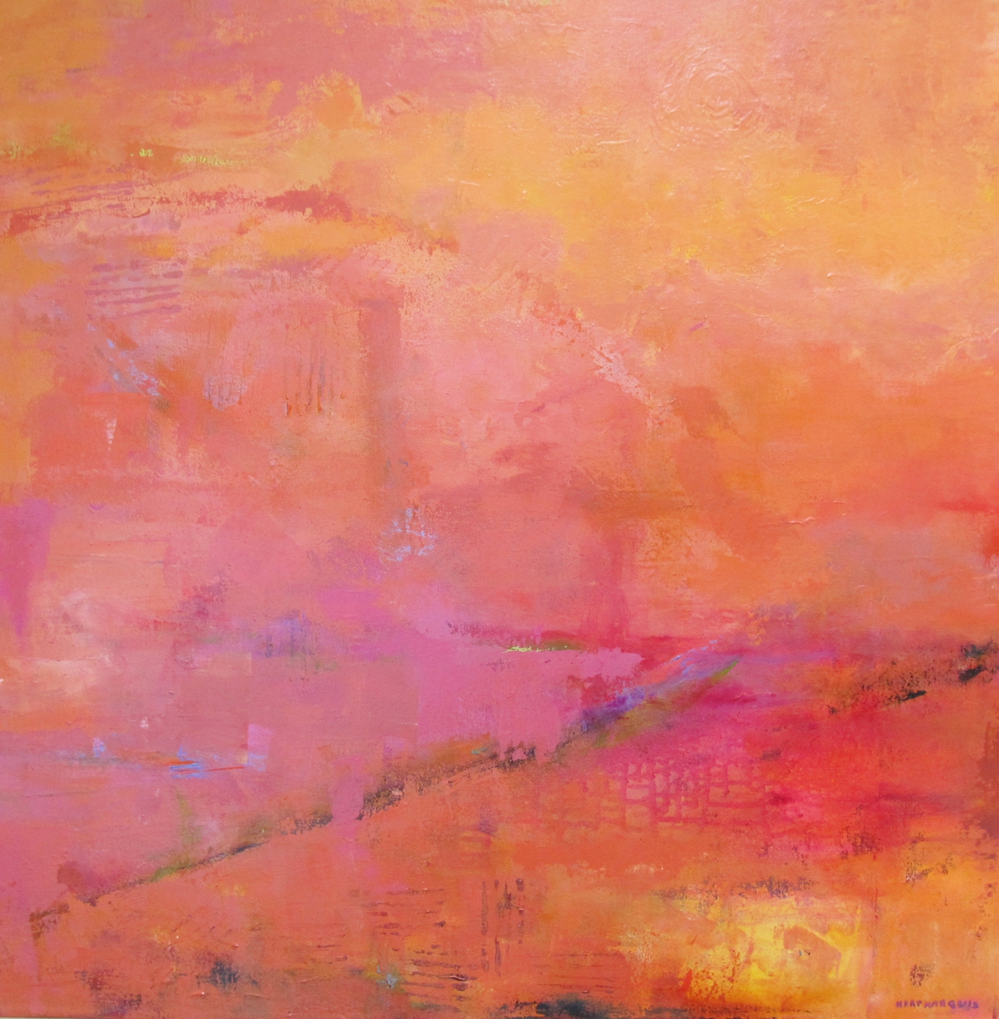
The Language of the Sun, acrylic on canvas, 30 x 30 x 3/4 inches. Ann Hart Marquis
Speaking of magenta, when it is mixed with cadmium yellow, an interesting warm orange develops. It is one of many interesting variations of orange.
Another objective on this painting was not to include a horizon line. Since I used a 30×30-inch canvas, I had a lot of canvas to cover with this interesting and challenging color.
Here is a link to an orange color chart that demonstrates the variations of orange that can be created. I am not sure where their names came from, but it is interesting to view.
I particularly liked Coquelicot, which is the French name for the red-orange flower that grows all over France. The color Cinereous is interesting also. So much to learn.
Of course, I then had to investigate the symbolic meaning of orange. “Orange aids in the assimilation of new ideas and frees the spirit of its limitations, giving us the freedom to be ourselves. At the same time it encourages self-respect and respect of others.
Orange is probably the most rejected and under-used color of our time. However, young people do respond well to it as it has a degree of youthful impulsiveness to it.”
Who knew! I thought
This week I think I will go with gray to try to calm down my impulsiveness.
I love to paint in tones of green. The painting that I did this past week in my painting class started as one painting and then it decided it wanted to be completely different. Unfortunately, I don’t have a photo of the first layer. Fortunately the first layer is just random colors, so it is not a big problem.
I told the class that I had been painting Ireland. My intent was to not paint Ireland in this class. That was not the case, however. It had a lot of red-orange at the top and very bright yellow green at the bottom. It became more and more green until it morphed into what I think is one of my best paintings of Ireland.

The Green, Green Grass of Home, acrylic on canvas, 30 x 30 x 3/4 inches. Ann Hart Marquis
As with most of my paintings I like to create layer over layer what various mark-making lines in each layer. My teacher calls me a builder. I rather like that reference. When she saw the finished painting she commented that there must be 32 different greens in it.
Due to being in this class, this painting and the one I am working on now will be in an upcoming group exhibit at a very lovely restaurant here in Albuquerque. This is a busy time in New Mexico because the weather is quite wonderful—sunny and a little cool. The exhibit will run from October 1 – December 30, 2016.
Also each October the International Hot Air Balloon Show is held here and Albuquerque is packed with tourists for at least a week. It is a good time to be in an art exhibit.
And my current painting which will also be in the exhibit is an abstract in hues of orange and magenta! It is not green. It does not remind me of Ireland. I purposely left all my greens and blues at home the day of the class. I just took reds, yellow and magenta. It seems a bit shocking to me at the moment. We will see how I finish it.
If you read my post from last week, you know that I started taking an abstract painting class. Part of the class includes critique, so students can bring in pieces that they are working on for feedback from the teacher. Also, at the end of the class we all got together and critiqued each other’s work.
It was a very helpful process especially to be able to bring my work and say “what does this need.” Fortunately, the piece that was on my post last week got good feedback from the teacher.
She said it was almost finished and just need two swipes of thicker paint, almost like an impasto. I like to paint thickly especially with my palette knife. I am now trying a very large palette knife about 2 1/2 inches wide and 6 inches long. Needless to say, it can cover a lot of canvas.
She suggested that it be in the same color as what was already on the canvas. That was not too difficult a challenge except mixing paint to the exact color as I did several days previously, always takes patience.

The Nature of Water and Air, acrylic on canvas, 24 x 30 x 1.5 inches. Ann Hart Marquis
I also started a new painting in class that I almost completely painted over once I got home. I was trying to follow her discussion and suggestions without listening to how I wanted to paint.
Next week, I think that I can incorporate her suggestions and still stay true to myself.
If you read my blog with any kind of regularity, you know that I sometimes think a painting is finished, live with it awhile and then decide that it has some kind of major problem. I have just come to the point on the painting below that it is time to just stop and take a long look at it before proceeding.

Untitled- Ireland, acrylic on canvas, 24x30x1.5 inches. ©Ann Hart Marquis
Fortunately, next week I start an abstract painting class where I can work on what I want including getting feedback from the teacher Janet Bothne. If I feel stuck or think that I don’t know what to do next, I can get advice. So this class sounds perfect for me.
In addition, this class includes a critique time with the whole class where I can get or give feedback. I have been looking for an artist critique group for several years. I am excited about the idea that other people will be giving me opinions about my work.
I have friends who do not like to have their work critiqued. According to artist and blogger Sharon Hicks, “Some artists cringe at the mere thought of having their work critiqued. The very word ‘critique’ is based on the word ‘criticism’, and in our culture that word has taken on a negative connotation, since to criticize something usually means to point out its faults.”
According to the dictionary, however, the word critic derives from the idea of someone who judges, evaluates, or analyzes literary or artistic works, dramatic or musical performances. To me this is a neutral statement. Ideally a critic can give both positive and negative responses. It relates to the idea of useful criticism.
For me, good and useful criticism serves one purpose: to give the creator of the work more perspective and help them make their next set of choices. I like the idea of having a set of choices.
I am also open to critique right now. If anyone has ideas of where this painting needs to go next, I would be delighted to hear them.
This week has been a frustrating one for me because of trivial obligations like an annual doctor’s appointment and buying food. Activties like this cut into my painting time. So I have not finished the Irish painting that I am working on.
Since I frequently think of my journey from never having painted to now, I thought I would write about a painting that I did three years after my first painting class in France. This time the painting class was again in France, but not where I had originally painted. It was in Collioure on the Mediterranean where it meets the Pyrenees.

Collioure, France, acrylic on canvas, 11 x 14 inches. Ann Hart Marquis
Collioure is a very picturesque small town that has drawn many painters including Matisse, Derain and Dufy. It is referred to as the birth place of the Fauvism movement in painting. This class was taught by the same teacher I first had in Soréze, France. She considered herself an Fauvist painter. She was responsible for my first exposure to Fauvism.

Collioure, France
As you can see from the above painting, my drawing skills were still lacking as were my use of brush strokes and layering color. I had not yet mastered the idea of perspective. Fortunately, it is a very colorful town so some of the colors were representative of what I saw and some were colors that were already a favorite part of my palette.
This painting was done in plein air, while I was sitting on the steps of a lovely house that looked down into the town and surrounding hills. It was an ideal place to paint.
Although today is the first time that this piece has been photographed, I see it every time I walk into my studio because it is hanging on the side of a cabinet. It reminds me of how I started and how far I have come. I have kept all of my drawings and paintings over the years. The only ones that I don’t have are sold.
It is important to me to be able to look back on all of the work I have done. They always make me smile.
As I was studying this painting, deciding if it was done and trying to think of a title, I had an interesting experience. I felt pulled into the painting. I wanted to walk through the grass and see the Irish Atlantic Ocean that I imagined was on the other side. I felt like walking into a painting.

A Place in My Imagination, acrylic and charcoal on canvas, 14 x 14 x 1.5 inches.
I am sure I have had this experience before with one of my paintings, but I couldn’t remember one that was so compelling to me. I have certainly had similar feelings with other paintings that I have seen. I once found a painting at the Louvre that was so captivating to me that I stood in front of it for 15 minutes.
I think that imagining walking into a painting somehow is related to the general wanderlust I am feeling at this time. It is possible that I need to go back to Ireland—or another Celtic place.
On the practical side of this painting, I approached it differently than my other Irish paintings. I didn’t put any medium on the canvas except black gesso. Previously for added texture, I used some type of molding paste on the others before I painted.
This time the painting had little texture except for paint when it was finished. Since I like texture, I applied an extra heavy gloss gel to the canvas and roughed it up to give the kind of texture that I was looking for. I like the effects although they can’t really be seen in the photograph.
I haven’t used heavy gloss gel much before. It was an experiment. When it is applied it looks like it is going to dry white. However, regardless of how thickly it is applied, it dries totally clear. The gel I was using was Liquitex Super Heavy gloss gel. I like the look and may try it again from time to time.
When I was in California last summer doing an artist residency I was called a tonalist painter for the first time. My work had never been referred to that way before and I recognized what association was being made.
I very frequently will tone down my colors with grays or sometimes with a color’s complement. For example, I don’t like phthalo blue by itself, but I do like it with some value of gray. Here is an example of a painting that I just finished.

A Song of Wandering, acrylic and ink on canvas, 24x30x1.5-inches. Ann Hart Marquis
Traditionally, tonalism (1880-1915) involved creating a painting permeated by a dominant tone and in a limited color scheme. Often, at least historically, painters worked mostly in earth colors so black would have been a common color on their palettes.
In tonalism, the palette is minimal, characterized by warm hues of brown, soft greens, gauzy yellows and muted grays.
Here is an example of a painting by the tonalist artist James McNeill Whistler (1834-1903.)

Nocturn Sun-James Mc Neill Whistler
According to Stapleton Kearns, “Usually the goal of tonalist painting is the production of a mood in a painting rather than the representation of any actual place. The color, design and the mood were the subject rather than a unique and spectacular location.”
Many of my paintings are similar in color to a traditional tonal style.
• I eliminate details for broader brushstrokes and subtle transitions of tone.
• Frequently I use a neutral palette-mainly cool colors: green, blue, mauve, violent, grays, to produce similar tones.
• I also sometimes like high horizons to bring focus to the foreground.
• I like to use glazing techniques, layering thin layers of color over underlying colors
• I like to paint wet on wet.
• I like to start with a warm undertone even if I use black gesso and then layer cool overtones to achieve some tension of color.
• I like the idea of the “lost edge” technique which results in flow of color and atmospheric quality.
• I don’t like to paint specific, recognizable locations, but rather my impressions of a place or scene.
Will I continue to paint in this style? It appears that for my Ireland series I will. After that who knows.
